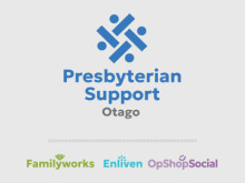
Presbyterian Support Otago is adopting a refreshed brand identity, generously gifted by Presbyterian Support Northern and approved by Presbyterian Support New Zealand for use across all regions.
The PSO Board has endorsed this change as it offers a more modern, unified look and supports our community focus.
Still us, just refreshed...
We have begun the process of updating our digital platforms and will gradually replace printed materials as needed over the coming years.
This phased approach ensures our branding is updated and implemented with minimal financial impact. During the transition, it’s expected that both old and new branding will coexist for a period of time.
About our new branding...

The Presbyterian Support symbol is based on raranga (Māori weaving) and represents whānaungatanga - people working together to support others.

Family Works features the harakeke (flax plant) representing the family unit – with children at the centre, surrounded by parents and grandparents - tamariki, matua and tipuna.

The Enliven symbol represents a person’s mauri (life force), drawing inspiration from the sun and flower forms – symbols of warmth, energy, and care. The teal colour and vibrant design reflect positivity, optimism, and our commitment to helping people thrive as they age.

The opshop’s new symbol emphasises the social aspect of charity op-shopping – shopping that supports our community. OpShopSocial is an inclusive space where social connection, creativity and kindness can flourish.
Introducing OpShopSocial, the new name for our charity opshop, Shop on Carroll. Our new name is launching December 2025
More than preloved finds, we’re a space for creativity, connection and conscious shopping. Every purchase, workshop and event helps PSO support local people in Otago.


